Women Gender and Sexuality Studies
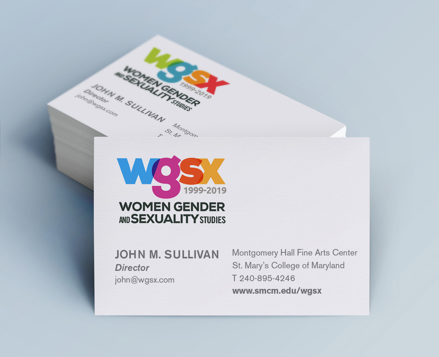
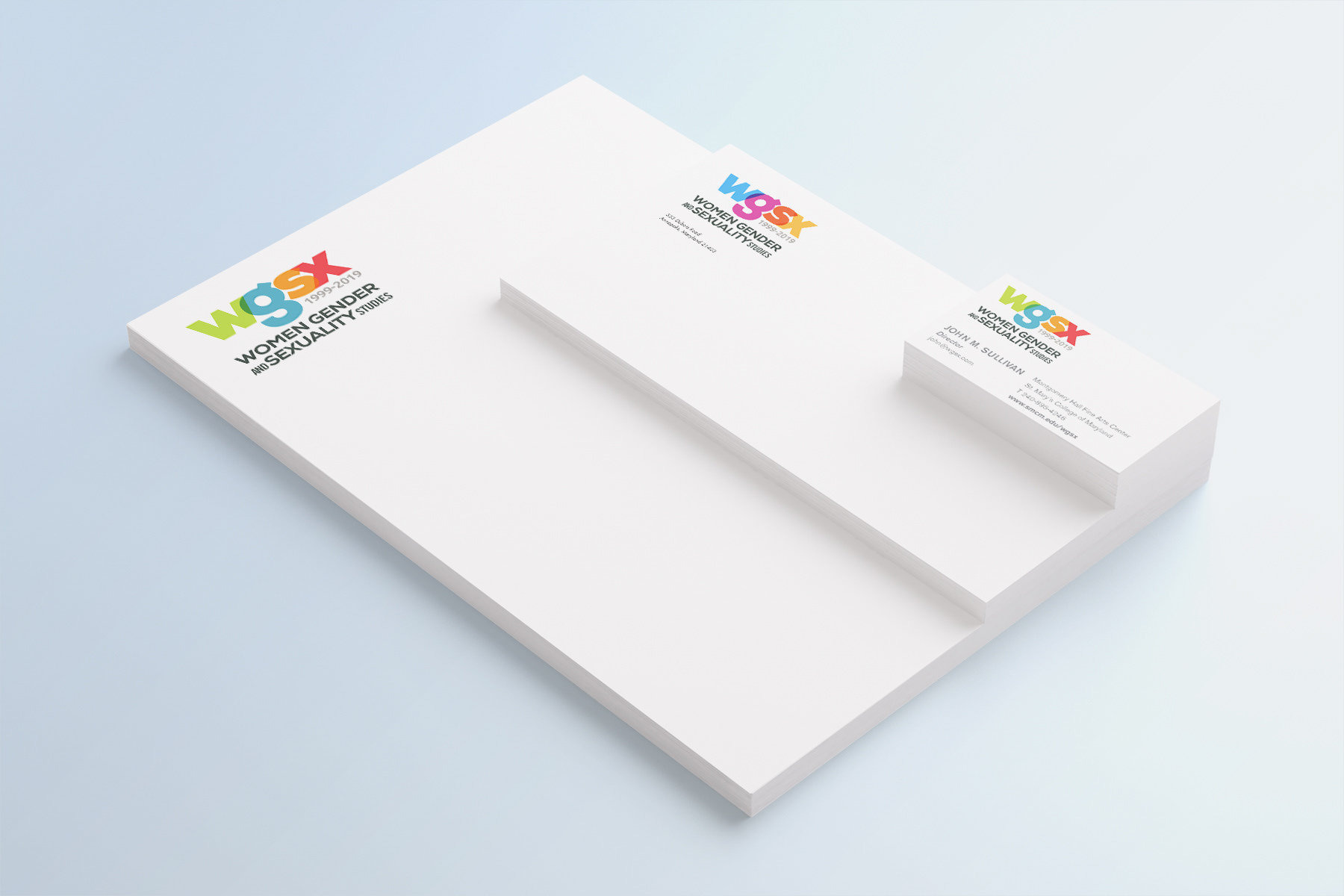
Today we are willing to accept variation within our logo designs, as opposed to the old days when we slavishly followed a single logo version.
Sometimes the need for variation is practical; when, for example, we adopt both a vertical and a horizontal logo version in order to accommodate the variety of places where it will be used.
And, sometimes the variation is symbolic as is the case with the above WGSX logo. Because the logo elements are distinctive, the visual integrity of the logo is maintained even when the colors are changed.
The color palette in the WGSX logo is designed to change from one use to another. Because the program celebrates the differences between all people and actively promotes a harmonious world view, this ever-changing interaction of colors makes sense. It gives the logo an added depth and meaning. Moreover, the color variety connotes a dynamic and versatile program.
And what’s more... it’s fun.
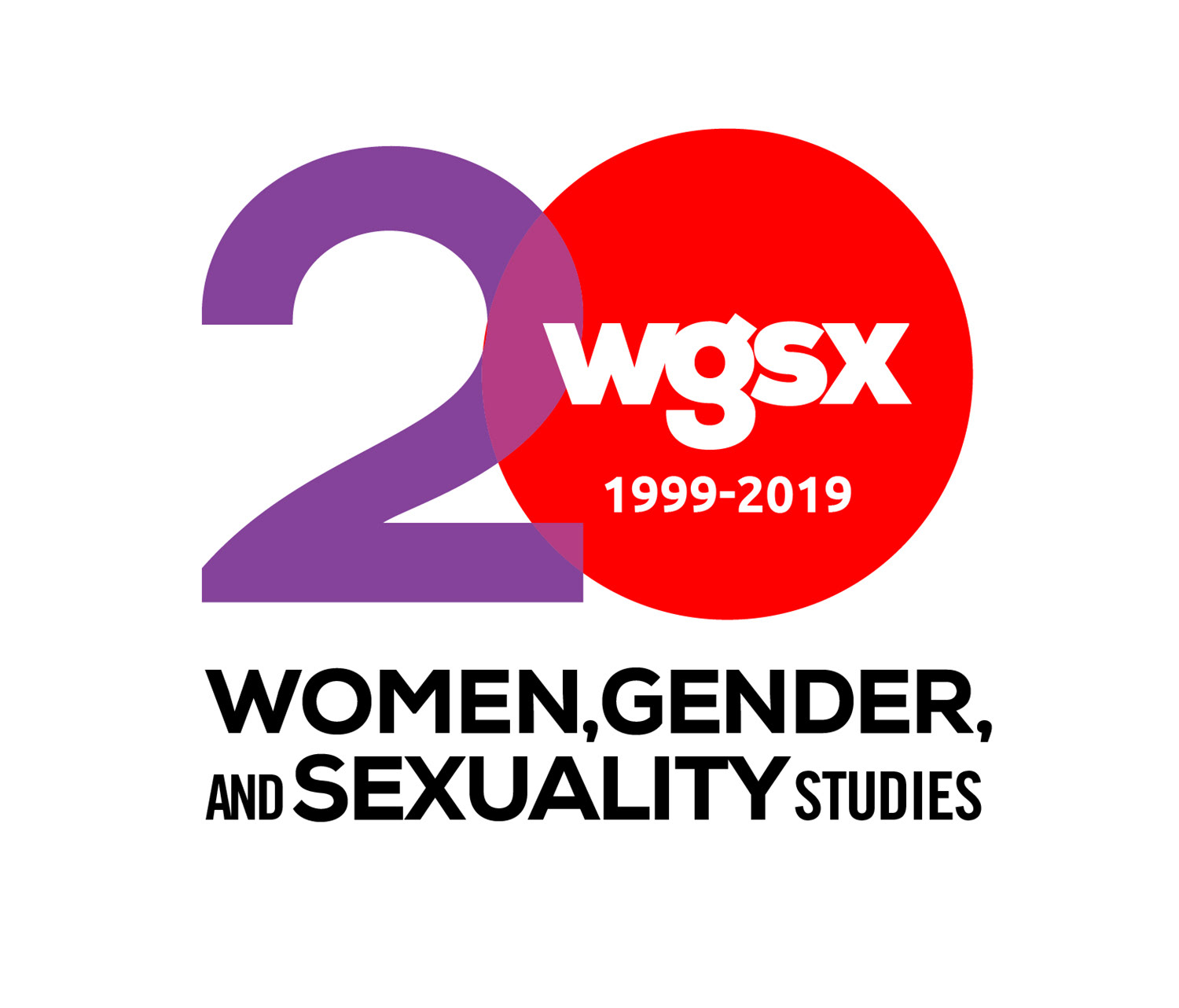
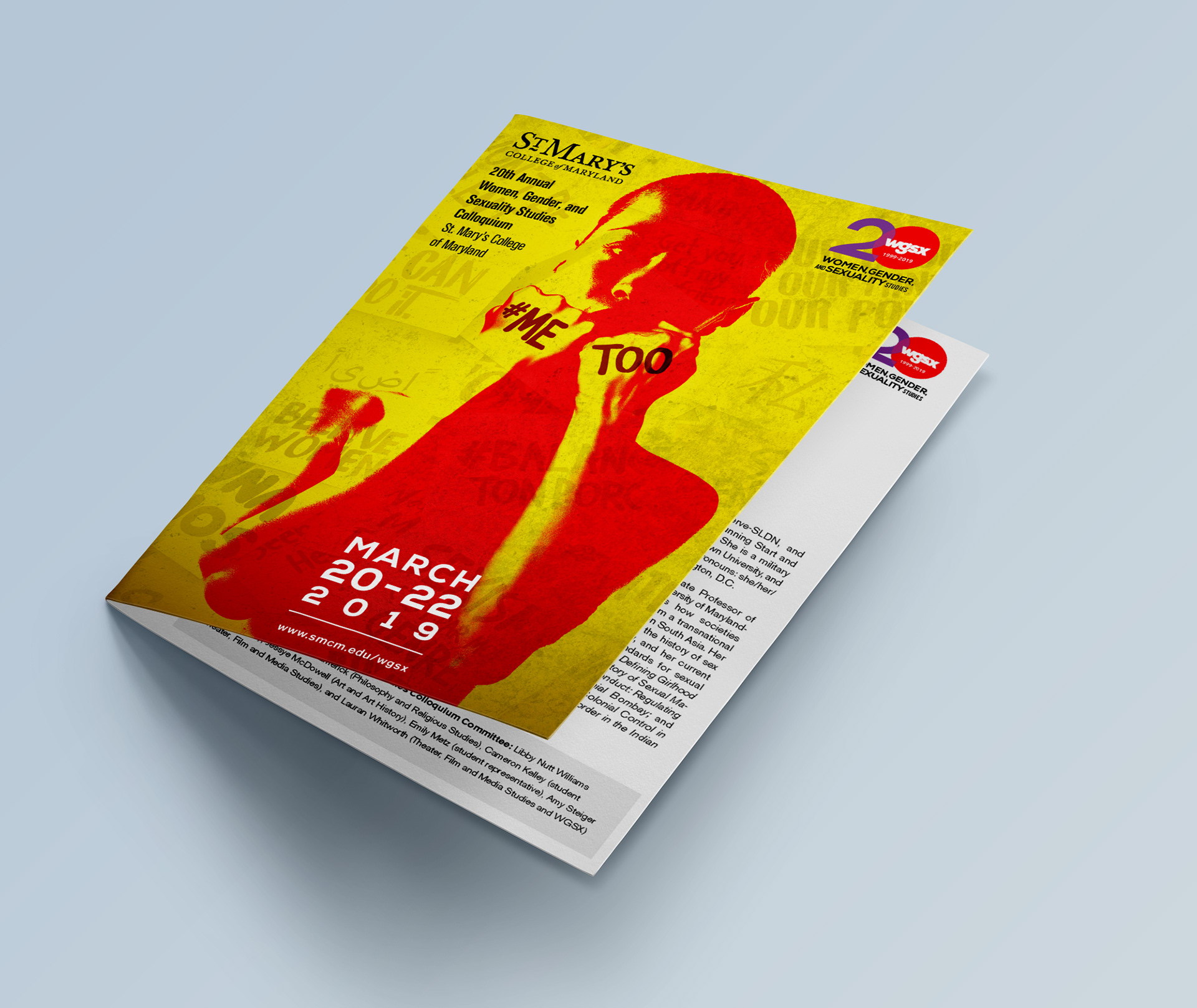
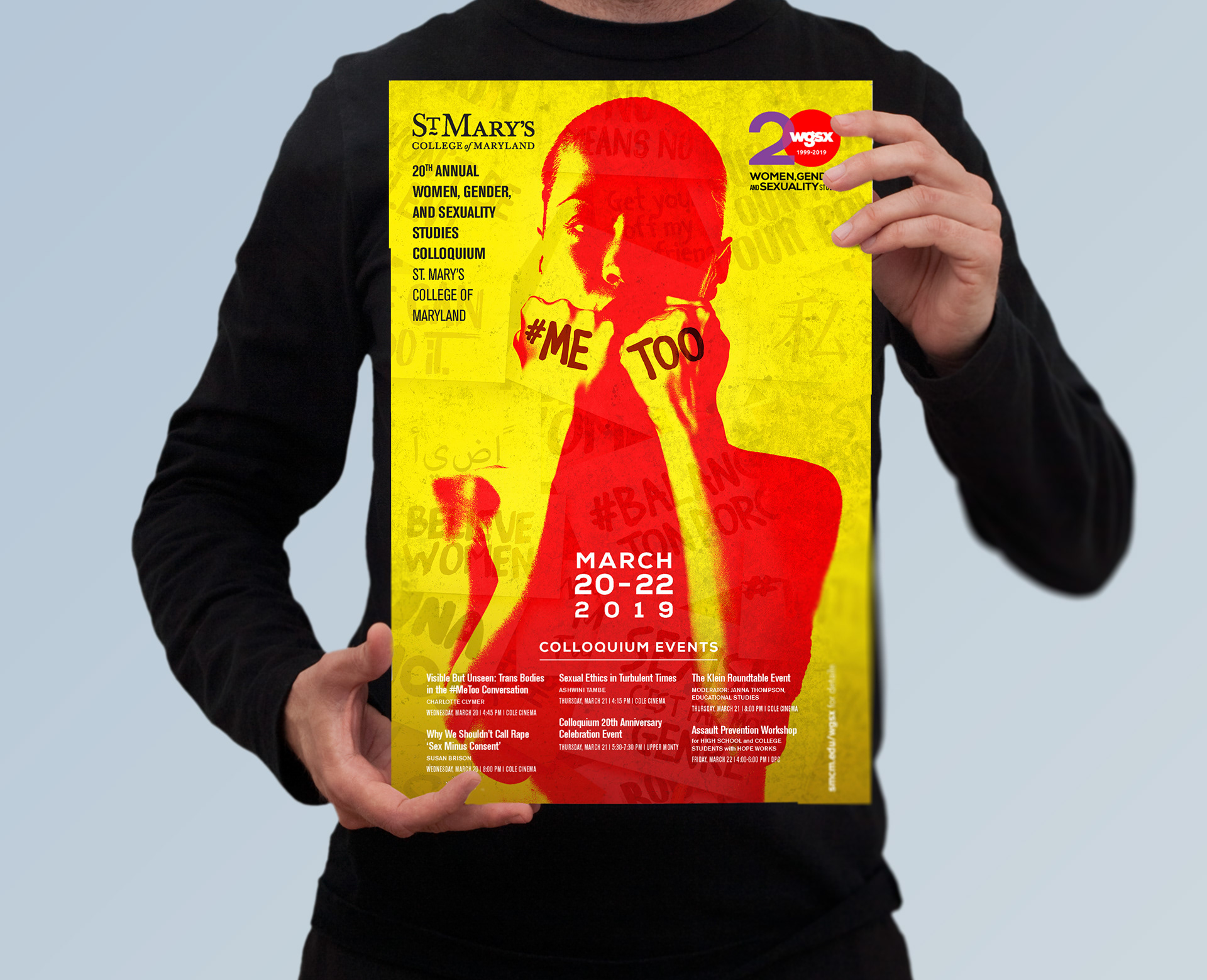
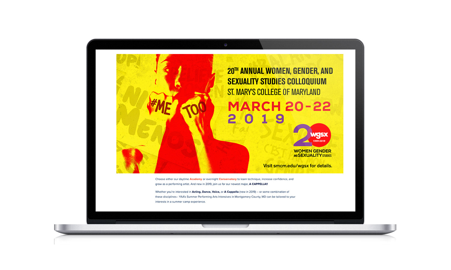
20th Anniversary Logo
To celebrate the 20th anniversary of the program’s annual colloquium event, we adapted the WGSX logo and created a new logo that will be used throughout the program’s twentieth year.
To maintain visual consistency, we repeated the program’s acronym inside of the 20 shape. We also employed the overlapping color treatment used in the primary logo.
The result? This anniversary logo is perfectly capable of representing the program on its own, without needing to be accompanied by the primary logo. Simple is better.
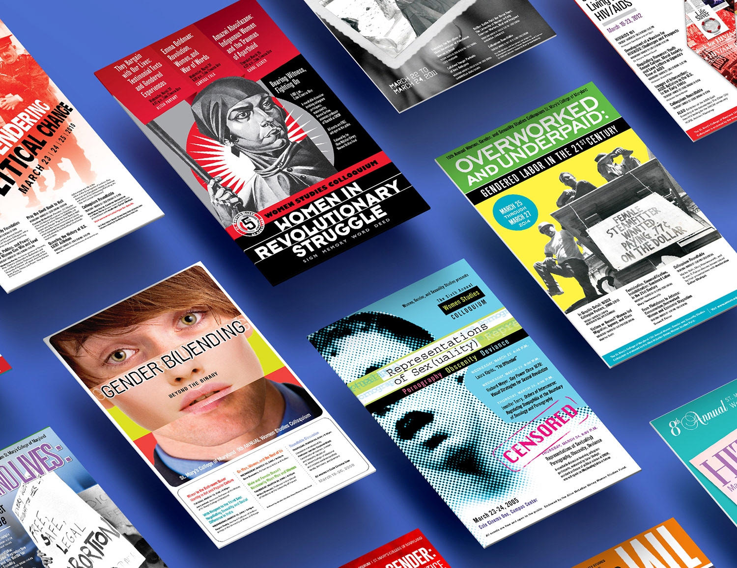
This is a smattering of colloquium graphics from the past