NYC Pride 2017
We pitched these designs as part of our proposal for NYC Pride’s 2017 celebration.
Graphic Approach 1
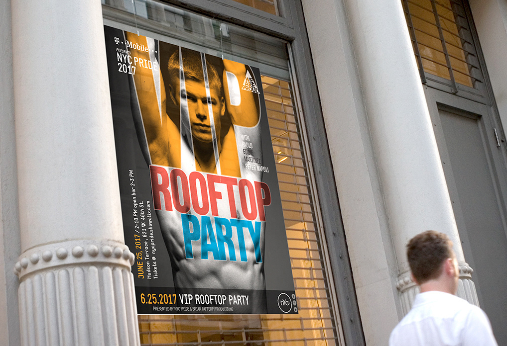
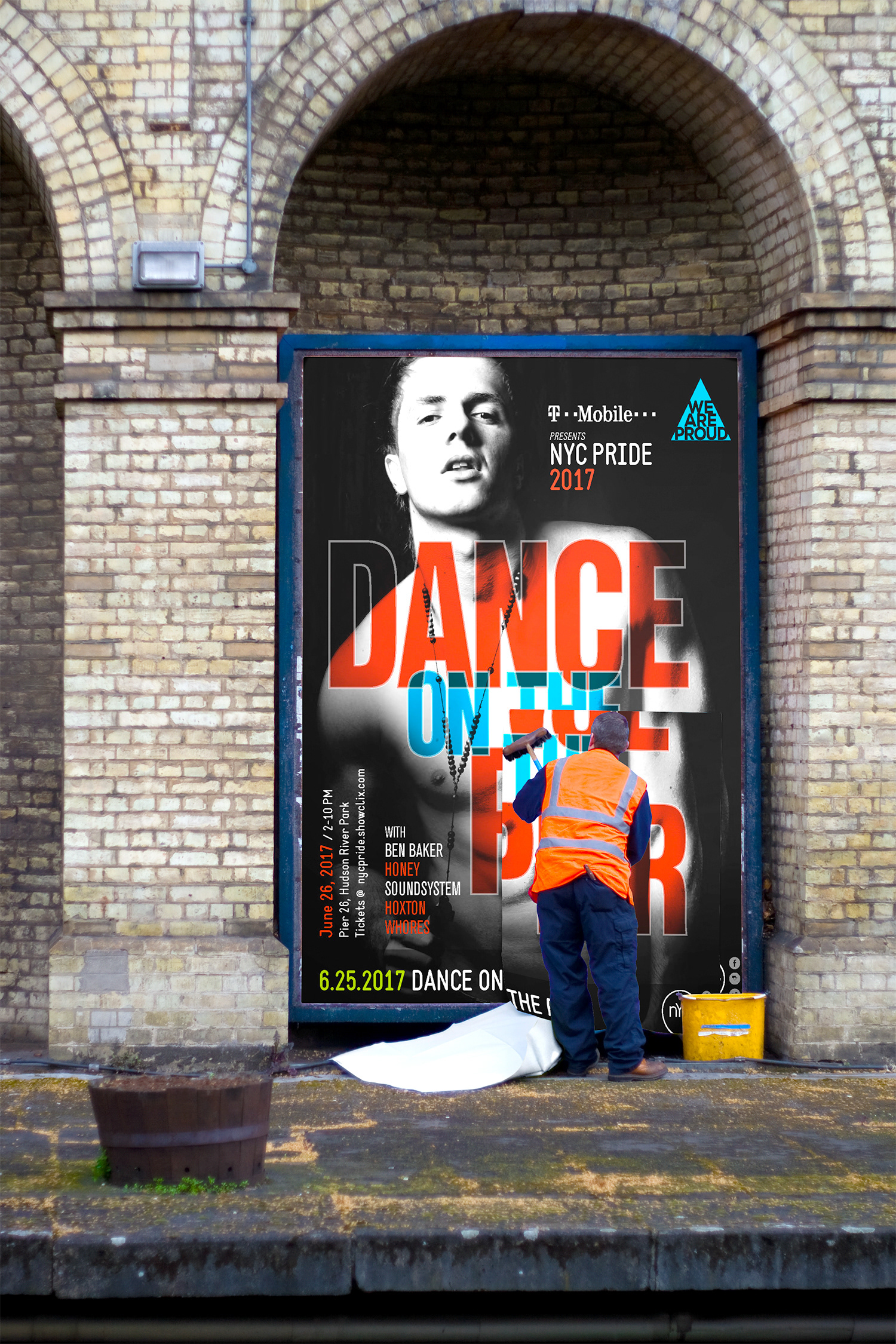
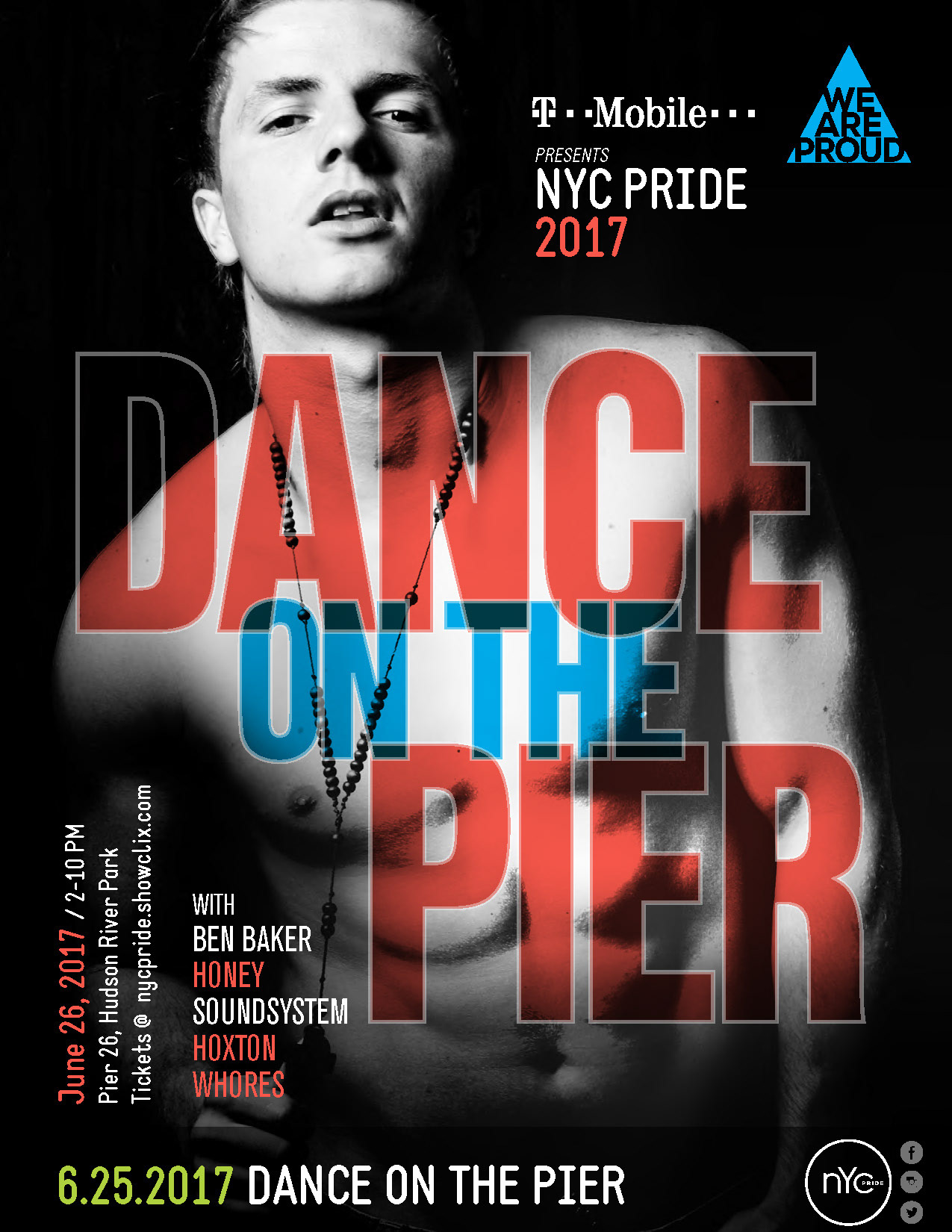
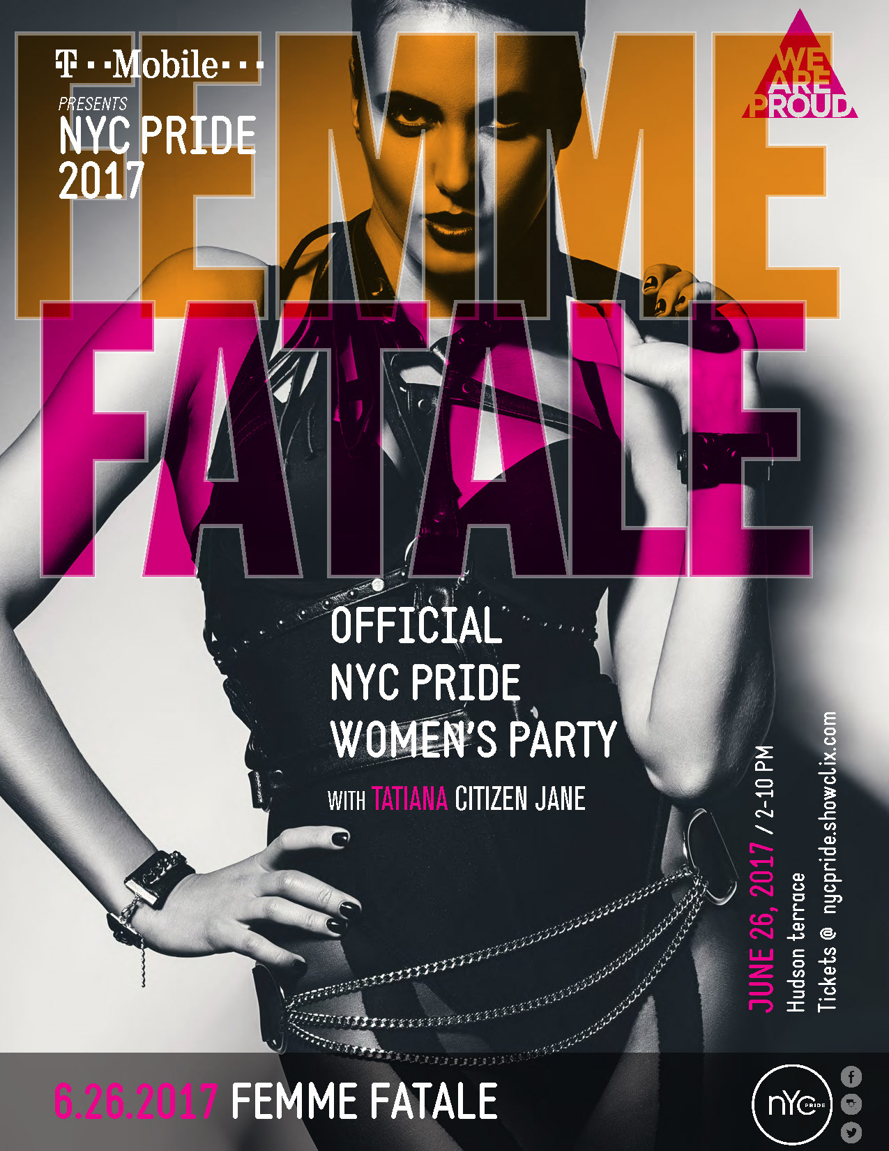
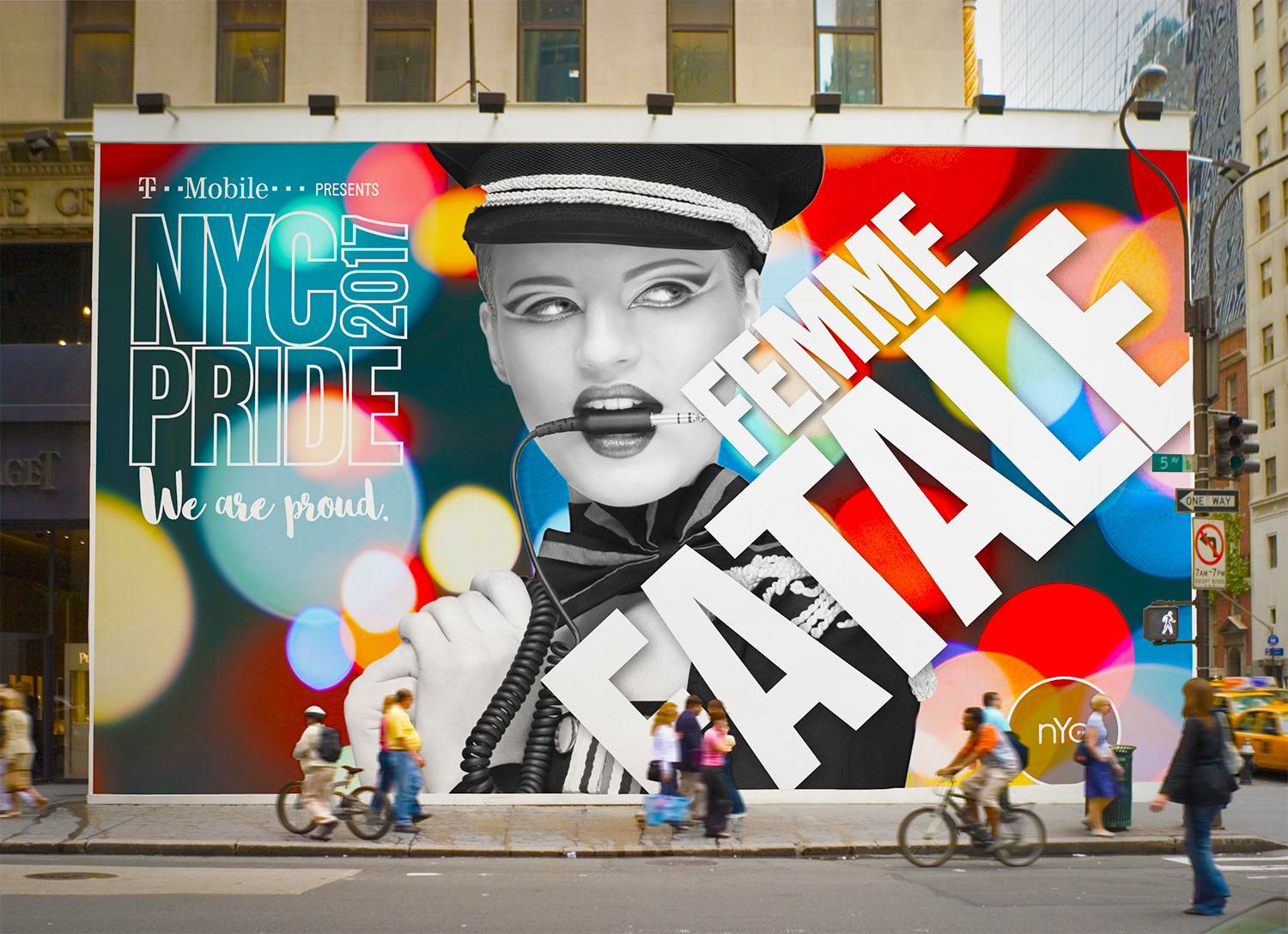
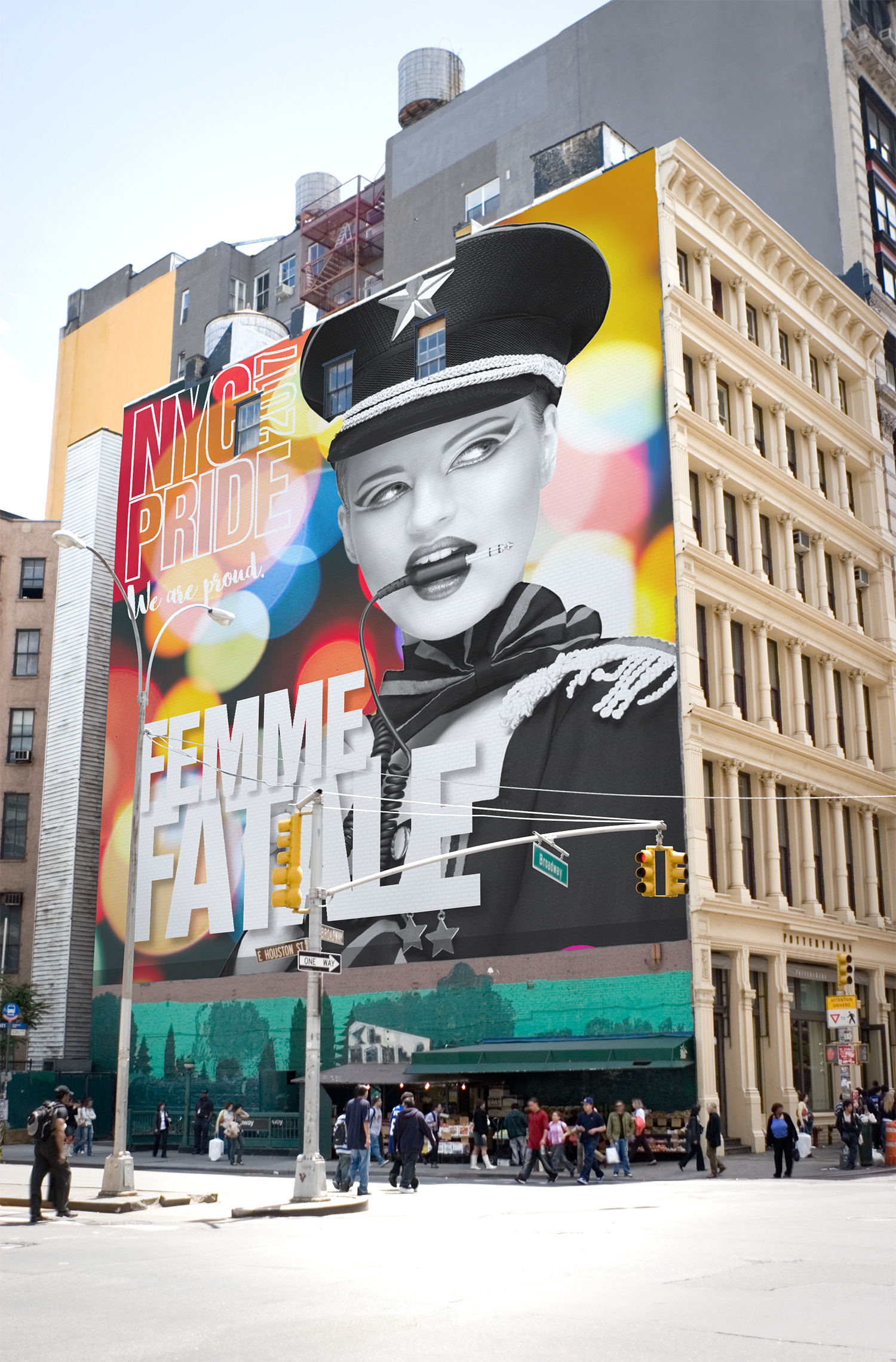
This approach features an alluring, high-contrast image that is embellished with bold and colorful typographic elements. The figures in the portraits engage the viewer through direct eye contact, and the play between image and text allows for an exciting synergy. The overall feel is direct, urban, sexy and provocative.
The high level of flexibility among the various brand elements makes it ideal for working across various platforms and applications.
Graphic Approach 2
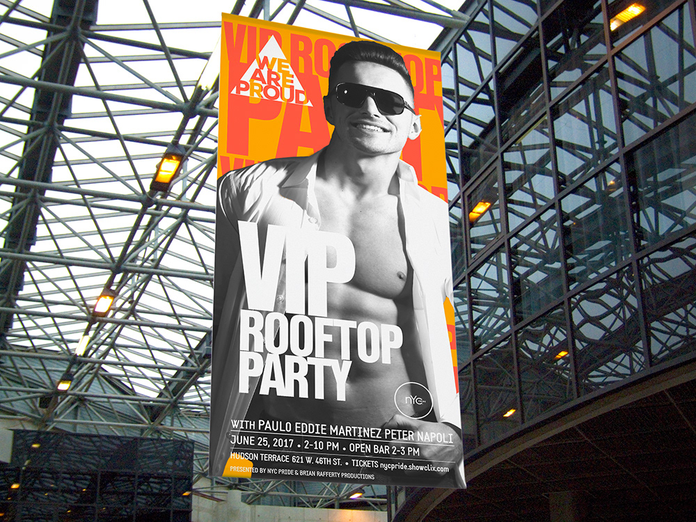
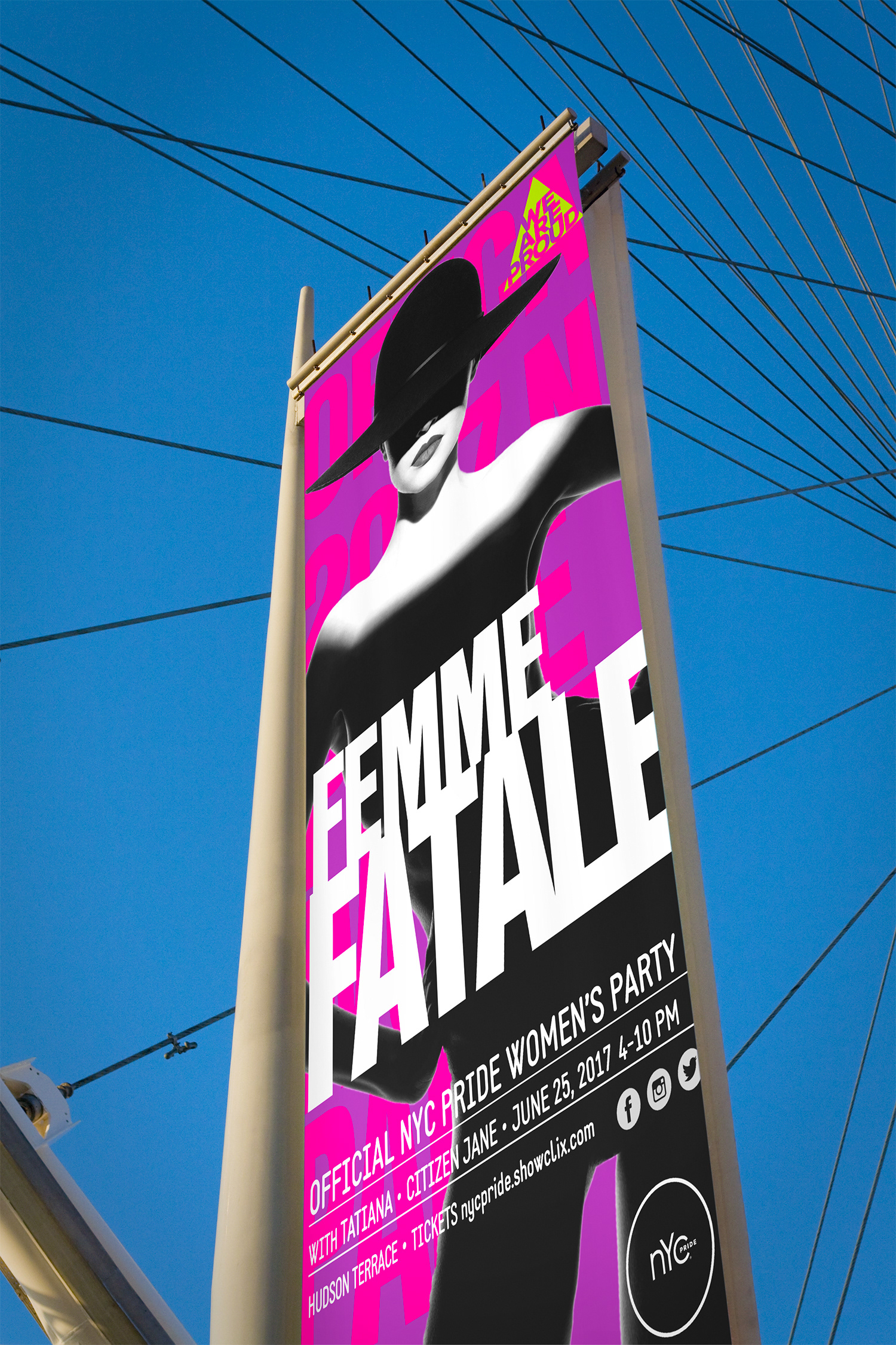
This approach features silhouetted figures set against bright blocks of color. The overall feel is light and fun. The name of each event is repeated behind the figure, creating a colorful background that provides extra space for messaging.
The “We Are Proud” theme is contained in a triangle. The triangle shape connects to gay iconography, and the compact nature of this graphic element offers exceptional flexibility in how it’s applied.
Graphic Approach 3
This treatment hails from the same family as Design 1, but it adds an element of camp. It also shows a new treatment for the “NYC Pride 2017” element, as well as an alternate way to handle the “We Are Proud” theme.
Graphic Approach 4
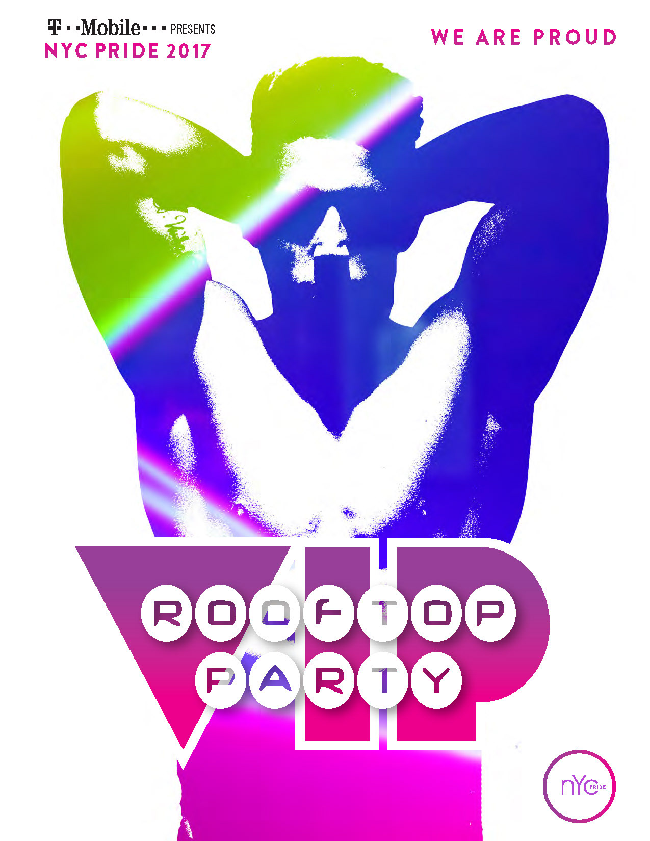
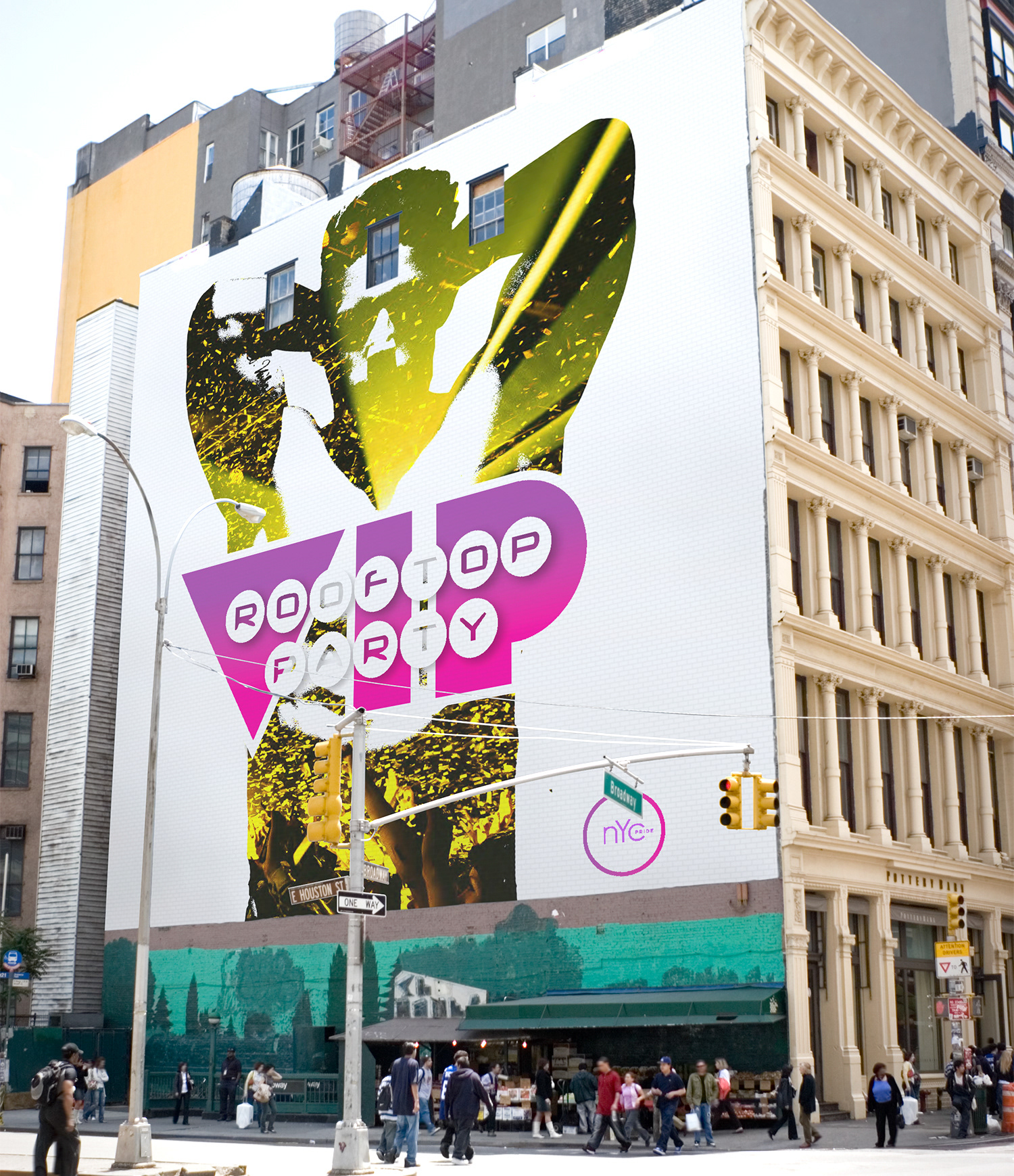
Here the human figure is abstracted and acts as a mask for an energetic and engaging background image. The emphasis is on overall mood or tone, rather than a specific type of individual. The background might even be comprised of more than one image.
