Branding for Boyden Gallery
The client wanted the logo to look modern and sophisticated. They also didn’t want to be too literal, as the gallery space is flexible and hosts exhibits that are diverse in theme and content. We wanted to capture these characteristics in the logo.
Application
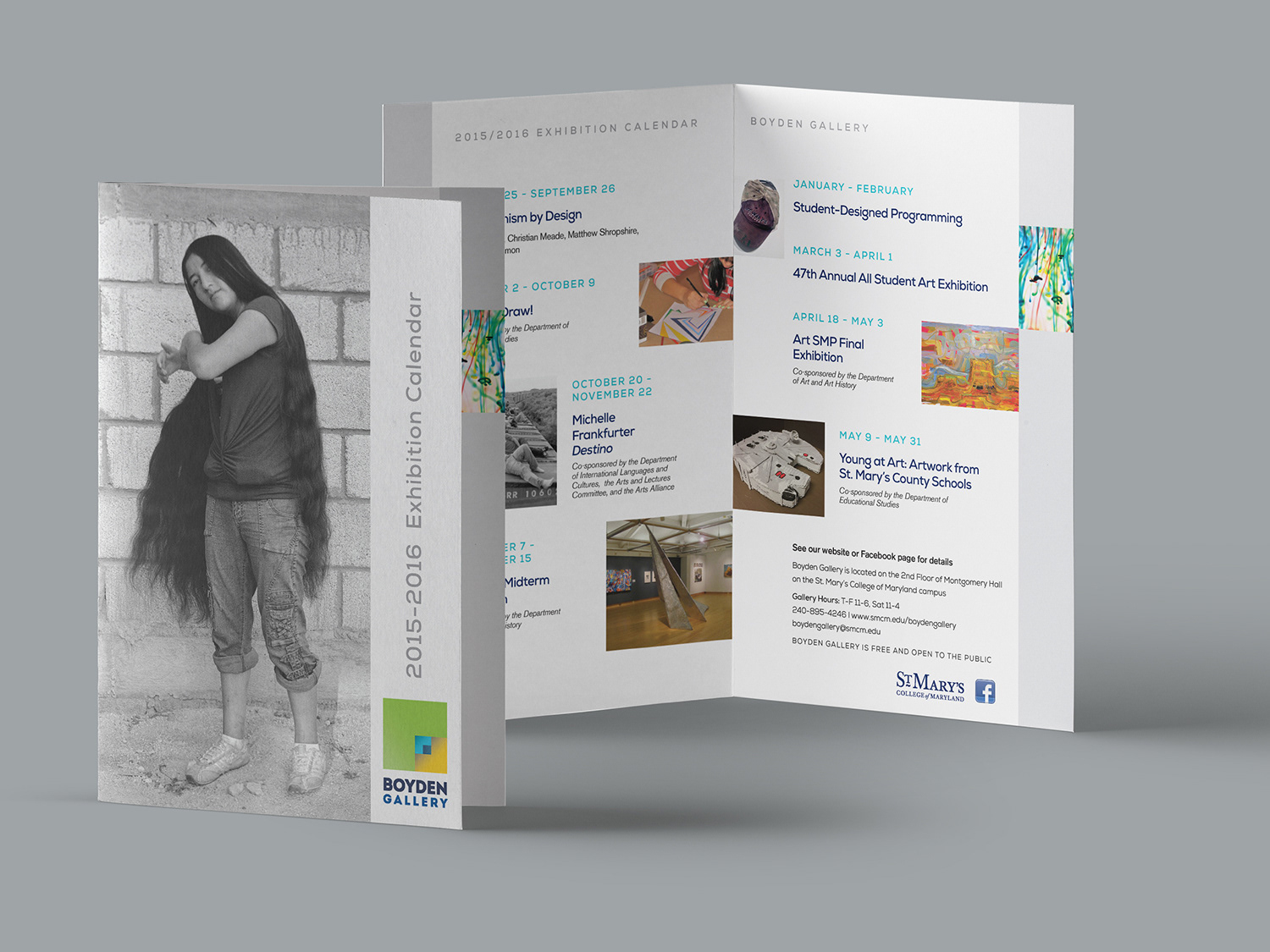
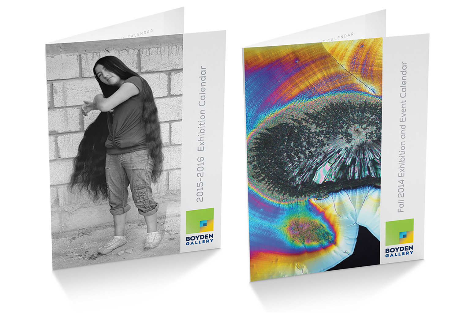
Once we had an established direction, we began applying the brand to various collateral pieces like these bi-fold season postcards. The logo’s very distinct color palette is a major player in how the various collateral pieces visually connect to one another.


Posters
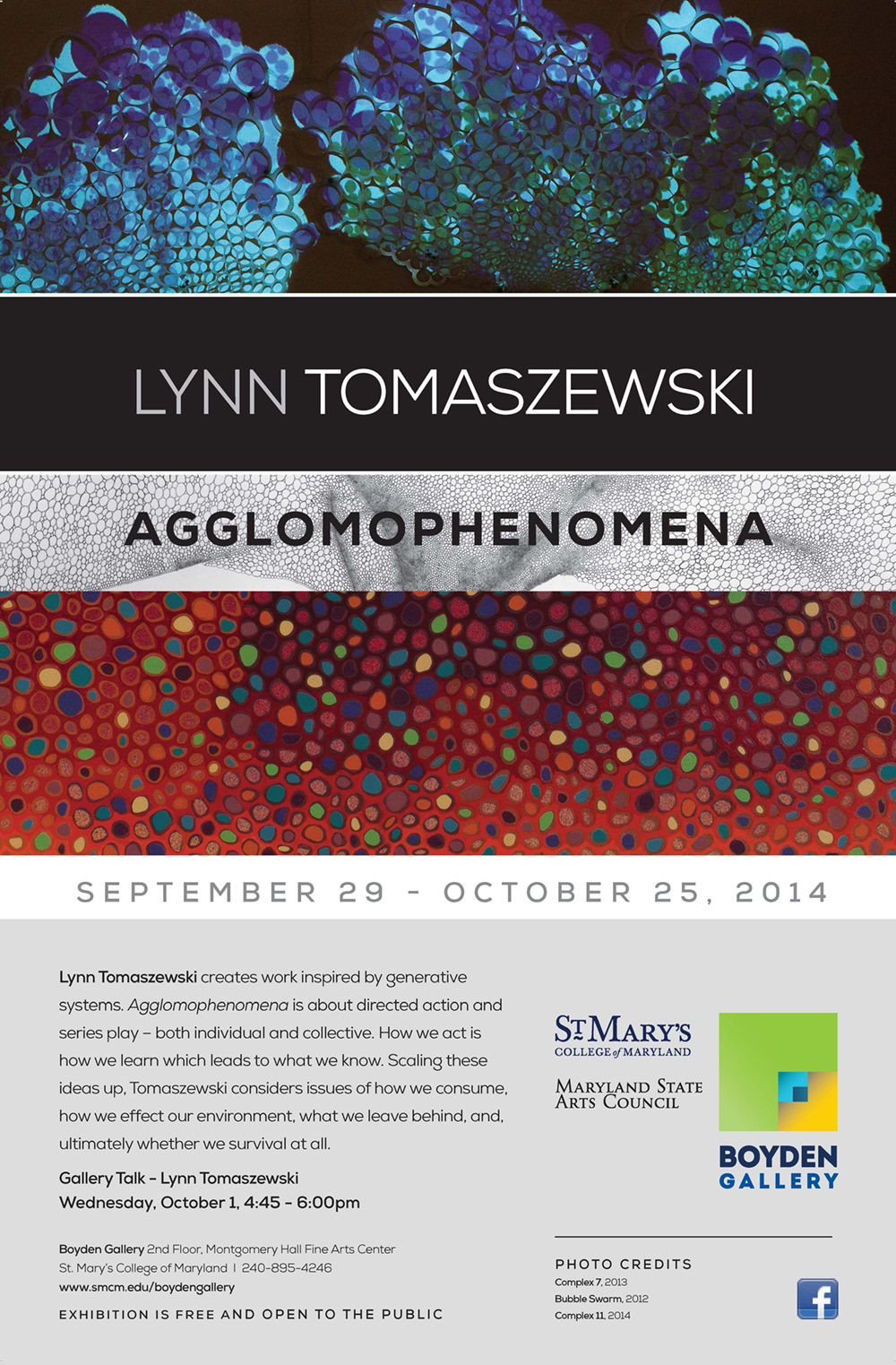
The Gallery curates 4-6 exhibits a year. The lower part of the poster layout remains consistent from show to show, but the top section changes depending on the artists(s) and their work. Because this can change significantly from show to show, we try to maintain some typographic consistency using oversized letters set in the same typeface.

